Using Seed: Documentation
 Getting Started
Using Seed:
Using Seed is as easy as copying and pasting the code you need. You can choose between only using a few snippets, taken from this website (just scroll!), or you can use the full 160 lines of code that make up Seed.
You can also access a Seed template found on Codepen. You can find that here:
See the Pen Seed: Utility CSS Code Snippets by Jason (@jasontcrabtree) on CodePen.
Full Seed Code: 160 Lines
The full Seed Code Snippet is included here, with the following sections below containing each component as labeled.
Feel free to pick and choose whichever you'd prefer!
CSS Snippet
/* --- SEED CSS Utility Code Snippets by @jasontcrabtree --- */
/* --- Code and documentation at https://seed-snippets.netlify.com/ --- */

/* --- LAYOUT --- */

/* Layout Variables */
:root {
--layout-0px: 0;
--layout-8px: 8px;
--layout-16px: 16px;
--layout-24px: 24px;
--layout-32px: 32px;
--layout-48px: 48px;
--layout-72px: 72px;
--layout-288px: 288px;
--layout-auto: auto;
}


/* --- TYPOGRAPHY --- */

/* Font Family */
html {
font-family:-apple-system, BlinkMacSystemFont, "Segoe UI", Roboto, Helvetica, Arial, sans-serif, "Apple Color Emoji", "Segoe UI Emoji", "Segoe UI Symbol";
}

/* Font Sizes */
h1 {
	font-size: 32px;
}

h2 {
	font-size: 28px;
}

h3 {
	font-size: 26px;
}

h4 {
	font-size: 22px;
}

h5 {
	font-size: 20px;
}

h6 {
	font-size: 16px;
}

.rg-body {
	font-size: 18px;
}

.sm-body {
	font-size: 16px;
}

.label {
	font-size: 18px;
}


/* --- COLOURS --- */

/* Primary Colours: Blue */
:root {
--primary-blue-700: #061342;
--primary-blue-600: #0c247b;
--primary-blue-500: #102fa0;
--primary-blue-400: #6579c2;
--primary-blue-300: #b4bee1;
--primary-blue-200: #d0d6ec;
--primary-blue-100: #e9ecf6;

/* Neutral Colours: Grey */
--neutral-grey-700: #191b20;
--neutral-grey-600: #676b7a;
--neutral-grey-500: #858894;
--neutral-grey-400: #b0b2ba;
--neutral-grey-300: #d1d2d7;
--neutral-grey-200: #ecedef;
--neutral-grey-100: #f9f9f9;

/* Supporting Colours: Red/Green/Yellow */
--support-red-600: #670a1e;
--support-red-400: #a0102f;
--support-red-200: #f6eaec;

--support-green-600: #0a6825;
--support-green-400: #0e9033;
--support-green-200: #c7e9d1;

--support-yellow-600: #f0b429;
--support-yellow-400: #fff3c4;
--support-yellow-200: #fffbea;
}


/* --- BUTTONS --- */

/* Default Button */
.button {
color: var(--neutral-grey-100);
background: var(--primary-blue-500);

border: 1px solid inherit;
border-radius: 40px;

box-shadow: 0px 4px 4px var(--neutral-grey-500);

display: inline-block;

margin: var(--layout-8px) auto;
padding: var(--layout-8px) var(--layout-24px);

font-family: -apple-system, BlinkMacSystemFont, "Segoe UI", Roboto, Helvetica, Arial, sans-serif, "Apple Color Emoji", "Segoe UI Emoji", "Segoe UI Symbol";

font-size: 16px;
font-weight: 600;
line-height: 1;

text-align: center;

cursor: pointer;
}

/* Button Extensions */
.button--sm {
	padding: var(--layout-8px) var(--layout-16px);
}

.button--rg {
	padding: var(--layout-16px) var(--layout-48px);
}

.button--lg {
	padding: var(--layout-16px) var(--layout-72px);
}

.button--confirm {
	background: var(--support-green-600);
	color: var(--neutral-grey-100);
}

.button--neutral {
	background: var(--neutral-grey-200);
	color: var(--neutral-grey-700);
	border: 1px solid var(--neutral-grey-300);
}

.button--delete {
	background: var(--neutral-grey-100);
	color: var(--neutral-grey-700);
	border: 1px solid var(--support-red-400);
}
Layout
Layout: 8px Grid
Pre-set layout variables based on an 8px grid. Use these variables for padding, margin and general sizing. You can also duplicate this syntax to add your own sizes or variables.
Thanks to SpecFM for the grid structure: The 8-Point Grid on @specfm
Layout Examples:
These examples apply top and bottom margin, however the layout variables can be used for margin, padding or whatever else is needed.
| Variable | Example | Pixels |
|---|---|---|
| --layout-0px | N/A | 0px |
| --layout-8px |
Margin: 8px auto
|
8px |
| --layout-16px |
Margin: 16px auto
|
16px |
| --layout-24px |
Margin: 24px auto
|
24px |
| --layout-32px |
Margin: 32px auto
|
32px |
| --layout-48px |
Margin: 48px auto
|
48px |
| --layout-72px |
Margin: 72px auto
|
72px |
| --layout-288px |
N/A
|
288px |
| --layout-auto |
Margin: auto auto
|
auto |
CSS Snippet
:root {
--layout-0px:	0;
--layout-8px:	8px;
--layout-16px:	16px;
--layout-24px:	24px;
--layout-48px:	48px;
--layout-72px:	72px;
--layout-288px:	288px;
--layout-auto:	auto;
}
Typography
Type Scale:
A x1.125 Major Second scale, calculated using https://type-scale.com/ and an 18px base.
Font Face:
System Font based on the website visitors operating system.
This scale was primarily designed to be used in Product Design, while a more pronounced type scale is recommended for Communication or Marketing Web Design (e.g Major Third).
Type Scale
| HTML | Example | Pixels |
|---|---|---|
| H1 | Major Second Type Scale | 32px |
| H2 | Major Second Type Scale | 28px |
| H3 | Major Second Type Scale | 26px |
| H4 | Major Second Type Scale | 22px |
| H5 | Major Second Type Scale | 20px |
| H6 | Major Second Type Scale | 16px |
| Rg-Body | Major Second Type Scale | 18px |
| Sm-Body | Major Second Type Scale | 16px |
| Label | Major Second Type Scale | 18px |
CSS Snippet
html {
	font-family: -apple-system, BlinkMacSystemFont, "Segoe UI", Roboto, Helvetica, Arial, sans-serif, "Apple Color Emoji", "Segoe UI Emoji", "Segoe UI Symbol";
}

h1 {
	font-size: 32px;
}

h2 {
	font-size: 28px;
}

h3 {
	font-size: 26px;
}

h4 {
	font-size: 22px;
}

h5 {
	font-size: 20px;
}

h6 {
	font-size: 16px;
}

.rg-body {
	font-size: 18px;
}

.sm-body {
	font-size: 16px;
}

.label {
	font-size: 18px;
}
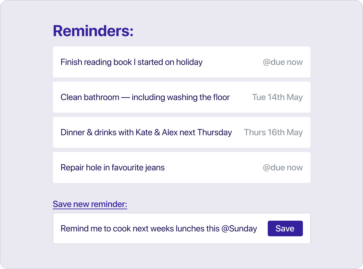
Code in Use: UI Example
Colours
Choosing Colours:
Seed's colours are deliberately neutral, providing a small base set of cool toned blues that you can customise and tweak to your own needs and preferences.
The primary colour is #102fa0, with the full range of spectrum generated using PALX Automatic UI Color Palette Generator.
Seed Colour Palette
| Variable | Example | Hex |
|---|---|---|
| --primary-blue-700 |
|
#061342 |
| --primary-blue-600 | #0c247b | |
| --primary-blue-500 | #102fa0 | |
| --primary-blue-400 | #6579c2 | |
| --primary-blue-300 | #b4bee1 | |
| --primary-blue-200 | #d0d6ec | |
| --primary-blue-100 | #e9ecf6 | |
| --neutral-grey-700 |
|
#191b20 |
| --neutral-grey-600 |
|
#676b7a |
| --neutral-grey-500 |
|
#858894 |
| --neutral-grey-400 |
|
#b0b2ba |
| --neutral-grey-300 |
|
#d1d2d7 |
| --neutral-grey-200 |
|
#ecedef |
| --neutral-grey-100 |
|
#f9f9f9 |
| --support-red-600 |
|
#670a1e |
| --support-red-400 |
|
#a0102f |
| --support-red-200 |
|
#f6eaec |
| --support-green-600 |
|
#0c7e2d |
| --support-green-400 |
|
#10a039 |
| --support-green-200 |
|
#c7e9d1 |
| --support-yellow-600 |
|
#f0b429 |
| --support-yellow-400 |
|
#fff3c4 |
| --support-yellow-200 |
|
#fffbea |
CSS Snippet
:root {
--primary-blue-700: #061342;
--primary-blue-600: #0c247b;
--primary-blue-500: #102fa0;
--primary-blue-400: #6579c2;
--primary-blue-300: #b4bee1;
--primary-blue-200: #d0d6ec;
--primary-blue-100: #e9ecf6;

--neutral-grey-700: #191b20;
--neutral-grey-600: #676b7a;
--neutral-grey-500: #858894;
--neutral-grey-400: #b0b2ba;
--neutral-grey-300: #d1d2d7;
--neutral-grey-200: #ecedef;
--neutral-grey-100: #f9f9f9;

--support-red-600: #670a1e;
--support-red-400: #a0102f;
--support-red-200: #f6eaec;

--support-green-600: #0a6825;
--support-green-400: #0e9033;
--support-green-200: #c7e9d1;

--support-yellow-600: #f0b429;
--support-yellow-400: #fff3c4;
--support-yellow-200: #fffbea;
}
Buttons
Button Design:
A simple collection of different buttons to use. The default .button style applies initial sizing, colour, typography, border-radius and default padding and margin. The additional stles extend the buttons in different ways (sizes, colours etc) and can be combined in different ways.
These styles can be used with button, form and link elements, depending on your semantic HTML requirements and use-case. More info on this: When To Use The Button Element
Button Descriptions:
- Default Base Styles
- Small
- Regular
- Large
- Positive Confirmation
- Neutral
- Destructive Confirmation
Button Styles:
| Class Name | Example |
|---|---|
| .button | |
| .button-sm | |
| .button-rg | Button |
| .button-lg | |
| .button--confirm | |
| .button--neutral | |
| .button--delete |
CSS Snippet
.button {
color: var(--neutral-grey-100);
background: var(--primary-blue-500);

border: 1px solid inherit;
border-radius: 40px;

box-shadow: 0px 4px 4px var(--neutral-grey-500);

display: inline-block;

margin: var(--layout-8px) auto;
padding: var(--layout-8px) var(--layout-24px);


font-family: -apple-system, BlinkMacSystemFont, "Segoe UI", Roboto, Helvetica, Arial, sans-serif, "Apple Color Emoji", "Segoe UI Emoji", "Segoe UI Symbol";

font-size: 16px;
font-weight: 600;
line-height: 1;

text-align: center;

cursor: pointer;
}

.button--sm {
	padding: var(--layout-8px) var(--layout-16px);
}

.button--rg {
	padding: var(--layout-16px) var(--layout-48px);
}

.button--lg {
	padding: var(--layout-16px) var(--layout-72px);
}

.button--confirm {
	background: var(--support-green-600);
	color: var(--neutral-grey-100);
}

.button--neutral {
	background: var(--neutral-grey-200);
	color: var(--neutral-grey-700);
	border: 1px solid var(--neutral-grey-300;
}

.button--delete {
	background: var(--neutral-grey-100);
	color: var(--neutral-grey-700);
	border: 1px solid var(--support-red-400;
}
Credits & Thanks:
Inspiration, tools & resources used: